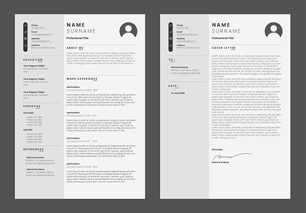
How Should a 2026 CV Look? A Visual Guide for Tanzania
A clear visual guide to what a 2026 CV should look like for job seekers in Tanzania and East Africa.

Alexander Phillip
Career Coach and Recruitment Expert

Recruiters in Tanzania spend less than ten seconds on a first scan of your CV. In that time, they decide whether you are worth a closer look. The look of your CV in 2026 is not about fancy design. It is about clarity, structure, and making it easy to find the facts.
This guide shows you exactly how a 2026 CV should look if you are applying for jobs in Tanzania or East Africa. We cover layout, length, sections, fonts, and the small details that make a big difference.
The Ideal Page Layout
Imagine a recruiter opening your CV on a phone during their commute. The first thing they should see is your name, followed quickly by your current or most recent role. Everything else should flow in a single column down the page.
The best 2026 CV layout uses plenty of white space. White space is not wasted space. It guides the eye and makes the document feel organised. Leave at least one blank line between sections and use consistent spacing between bullet points.
First Impression: Clean and Scannable
A modern CV looks clean at first glance. There is enough white space, clear headings, and a logical flow from top to bottom. Recruiters should be able to find your name, current or most recent job, and contact details without effort.
Avoid bright colours, multiple fonts, boxes, charts, or photographs unless the employer specifically asks for them. In Tanzania, a simple professional CV still wins over a decorative one.
The Standard Sections in Order
Most CVs in 2026 follow the same order. Straying too far from this order confuses recruiters who expect to scan quickly.
| Section | What it does |
|---|---|
| Contact details | Name, phone, email, city, LinkedIn if relevant. |
| Professional summary | Two to four sentences that sell your value. |
| Work experience | Most recent job first, with achievements. |
| Education | Degree, institution, year, relevant honours. |
| Skills | Hard and soft skills matching the job. |
| Certifications and awards | Only those that add value to the role. |
Length: One Page or Two?
For most job seekers in Tanzania, one page is enough. If you have more than seven years of relevant experience, two pages are acceptable. Three pages are rarely justified unless you are applying for a senior academic or executive role.
The rule is simple: every line must earn its place. If a section does not help the recruiter see why you fit, remove it.
Fonts and Formatting
Stick to professional fonts like Arial, Calibri, or Times New Roman. Use 11 or 12 point for the body and slightly larger for your name. Bold section headings and job titles, but do not overuse bold or italics.
Use bullet points for achievements. Start each bullet with an action verb and include a result where possible. For example, "Increased monthly sales by 20% through client follow-up" is stronger than "Responsible for sales."
Should You Include a Photo?
In most Tanzanian private-sector and NGO roles, a photo is not needed. Some government applications may request a passport photo separately, but it should not appear on the CV itself. Including a photo can lead to unconscious bias and takes up space that could show a skill.
ATS: What Machines See
Many large companies in Tanzania use Applicant Tracking Systems to filter CVs before a human sees them. To pass these systems, use a single-column layout, standard section headings, and avoid tables, graphics, or text in images.
Save your final CV as a PDF unless the system asks for Word. PDF keeps your formatting intact across devices.
What a 2026 CV Should Not Look Like
- Cluttered with icons, charts, or colour blocks.
- Written in all caps or mixed fonts.
- Missing dates or using vague job descriptions.
- Long paragraphs instead of bullet points.
- Listing duties without achievements.
Font Sizes and Spacing in Detail
Small font choices make a big difference. Your name should be 14 to 16 point. Section headings should be 12 to 13 point and bold. Body text should be 11 or 12 point. Anything smaller becomes hard to read, especially on mobile.
Line spacing should be 1.15 or 1.5. Single spacing can feel cramped. Double spacing wastes space. Use bullet points with a small space between each item so the list breathes.
Examples of Good and Bad Headings
Recruiters and ATS software look for familiar headings. Using creative names can confuse both.
| Avoid | Use instead |
|---|---|
| My Journey | Work Experience |
| Things I Can Do | Skills |
| Where I Studied | Education |
| About Me | Professional Summary |
How CV Looks Differ by Career Stage
A fresh graduate's CV should look different from a senior manager's CV. The graduate will have more space for education, projects, and attachments. The senior manager will have more space for achievements and leadership.
However, both should follow the same principles: clean layout, clear headings, and results-focused bullet points. Do not try to look more senior than you are by adding unnecessary design elements.
Mobile-Friendly CV Tips
Many recruiters in Tanzania review CVs on their phones. A mobile-friendly CV uses short paragraphs, clear headings, and bullet points. Avoid wide tables that force horizontal scrolling. Test your PDF on your own phone before sending.
Printing Your CV
If you are taking a printed CV to a walk-in application or interview, use clean A4 paper and a reliable printer. Faded ink, smudges, or crooked printing create a poor impression. Print in black and white unless colour is specifically requested.
What Recruiters Notice First
Recruiters scan CVs in a predictable order. They look at your name, your current or last job title, the company name, and the dates. Then they glance at your summary and skills. If those elements are clear, they will read deeper.
This means the top third of your first page is the most valuable space. Put your strongest, most relevant information there. Do not waste it on a long objective statement or decorative graphics.
Colour and Design in 2026
Minimal colour is acceptable if used carefully. Dark blue or dark grey for headings can look professional. Avoid red, orange, or bright green. Never use colour for body text.
If you are applying to a creative industry such as graphic design or marketing, a slightly more visual CV may be appropriate. Even then, keep the structure clear and the content easy to find.
CV Look Mistakes That Cost Interviews
- Crowded pages. If the recruiter feels overwhelmed, they stop reading.
- Inconsistent formatting. Mixing bullet styles, fonts, or date formats looks careless.
- Too many sections. Stick to the core sections unless something truly adds value.
- Hiding dates. Missing or unclear dates make recruiters suspicious.
Sample Visual CV Outline
Here is a quick outline of how your CV should appear from top to bottom. Use it as a visual checklist before you finalise your document.
- Name at the top in a larger font.
- Contact line with phone, email, and city.
- Professional summary in three to four sentences.
- Work experience with clear dates and bullet points.
- Education with institution and year.
- Skills in a short list.
- Certifications or awards only if relevant.
Tools to Build Your 2026 CV Look
You do not need expensive design software to create a professional CV. A simple word processor like Microsoft Word or Google Docs is enough. Use built-in styles for headings and keep the document in portrait A4 format.
Free and paid CV builders can also help. Look for one that exports a clean PDF and does not force colourful templates. A builder built for Tanzania will already have the right structure and local examples.
How to Test Your CV's Look
Before sending your CV, test it in three ways. First, open the PDF on your phone to check mobile readability. Second, print it to check margins and alignment. Third, upload it to a free ATS checker or ask a friend to scan it in ten seconds and tell you what stands out.
If your strongest selling point is not visible within the first third of the first page, move it up.
Quick Visual Checklist
Before you send your CV, look at it on your phone. If it is hard to read on a small screen, a busy recruiter will struggle too. Make sure your name, phone number, and most recent role are visible without scrolling.
For a step-by-step writing guide, read how to write a CV in Tanzania. If you want a clean, ready-made format, browse our CV templates.
Frequently Asked Questions
How long should a CV be in 2026?
Most job seekers should keep their CV to one page. Candidates with more than seven years of relevant experience can use two pages. Anything longer is rarely necessary.
Should a 2026 CV include a photo?
No, unless the employer specifically asks for one. Photos are not standard for private-sector or NGO roles in Tanzania and can introduce bias.
What font is best for a CV in Tanzania?
Arial, Calibri, and Times New Roman are safe choices. Use 11 or 12 point body text and keep the design clean so recruiters and ATS software can read it easily.
Can I use colour in my CV?
A small amount of dark blue for headings can work, but avoid bright colours and graphics. Simple black text on white paper remains the safest choice.
Ready to Create Your Professional CV?
Put these tips into practice. Build a stunning, ATS-friendly CV in under 3 minutes with CV Chap Chap.
Create Your CV Now